
Leaving Beige Behind
It is the best possible sign of a color when nobody who sees it knows what to call it. (John Ruskin, 1859)

We are living through an epidemic of beige. Not beige as a color itself, but beige as a mindset. Beige is safe. Beige will fit. Beige asks for nothing and risks nothing. It reflects a collective fear of indulgence, of boldness, of color itself.


The word beige originates from the French term for natural wool left undyed, the raw shade of sheep’s wool before pigment or decoloration touched it. Even its origin speaks of neutrality, of something unfinished and untouched.
Yet color has always been a reminder of life. Every shade carries emotion, memory, symbolism. Colors have been celebrated, forbidden, politicized, and romanticized throughout history.
Today, colors are often given elaborate names, borrowed from people, objects, places, and phenomena. A name can completely transform the feeling of a shade. Beige references wool. Butter yellow, by contrast, feels warm, soft, and nostalgic. It is subtle, yet impossible to ignore. Something is fascinating about how a color named after one of the world’s most famous fats can immediately evoke comfort and richness.

Butter itself carries centuries of history. Its origins date back between 8,000 and 10,000 years, likely discovered accidentally when nomadic herders transported milk in animal skin sacks. The movement churned the cream naturally into solid fat. What began as an accident became survival, then ritual, then luxury.
For centuries, butter was made slowly and seasonally at home, using wooden plungers or hanging skin sacks. Production depended entirely on the rhythms of cattle and climate, usually limited to spring and early autumn, before advances in animal husbandry allowed year-round milking.
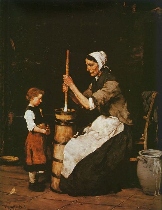
In the mid to late twentieth century, butter’s reputation shifted dramatically. Medical fears surrounding saturated fat and cardiovascular disease pushed butter aside in favor of margarine and industrial substitutes. What was once essential became unfashionable.
Then came its return. In the twenty-first century, butter experienced an artisanal renaissance. Nutritional perspectives softened, and the culinary world embraced high-fat, cultured butter once again. Regions known for exceptional dairy, such as Normandy and Ireland, became symbols of quality and craftsmanship.
The Yellow Book was one of the most influential literary and art periodicals of the 1890s. Published in London between 1894 and 1897, it became a symbol of the Aesthetic and Decadent movements in late Victorian culture.
The magazine combined literature, poetry, essays, illustration, and experimental visual design in a way that felt provocative for its time. Its yellow cover was intentional. In France, yellow covers were associated with controversial or risqué novels, so the title itself signaled rebellion against conservative Victorian taste.

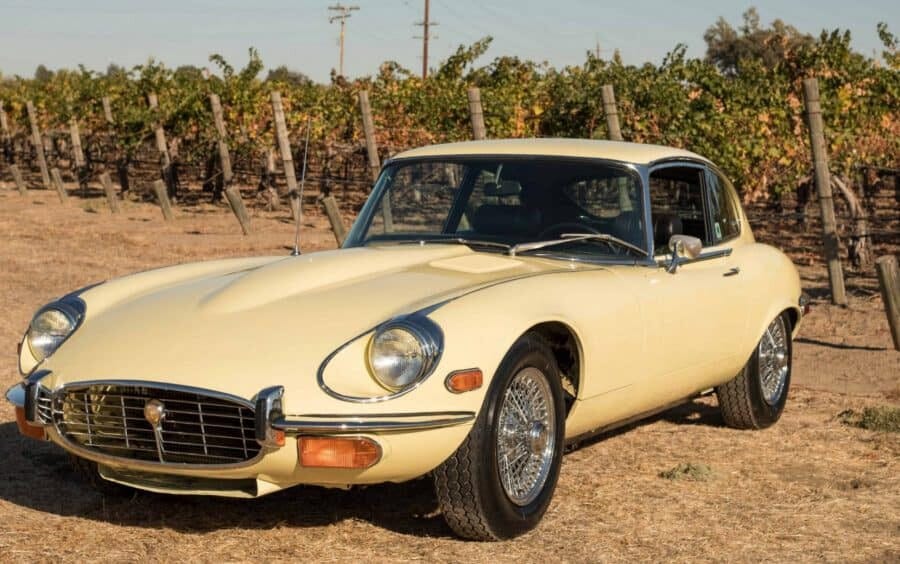
Primrose Yellow was never a loud color. On classic Jaguar cars of the 1960s and 1970s, it carried a restrained elegance that felt closer to parchment, cream silk, or faded English garden flowers than modern automotive paint. Unlike brighter racing yellows designed to demand attention, Primrose softened the car instead of overpowering it. The color allowed the curves, chrome, and proportions to remain the focus. It revealed the object rather than competing with it.
Something similar happened accidentally with the yellow Post-it Note. The shade was never carefully designed. It came from nearby scrap paper at 3M, yet it turned out to be perfect. Visible enough to catch attention, soft enough to disappear into daily life. Today, Post-it Notes exist in almost every color imaginable, but the yellow remains the most loved because the color became inseparable from unfinished thoughts, reminders, drafts, annotations, and ideas still forming.

Color changes the emotional meaning of objects even when the objects themselves remain untouched. A metal locker painted grey feels institutional and utilitarian. The same locker in butter yellow suddenly feels nostalgic, cinematic, almost comforting. Form stays identical, atmosphere changes completely.


Sabrina Carpenter becoming associated with butter yellow says something larger about how color works in contemporary culture. A signature color is never just repetition. It happens when a shade begins to feel emotionally inseparable from a person’s atmosphere. Butter yellow became attached to Sabrina Carpenter because the color already carries the same qualities people project onto her image, softness, nostalgia, femininity, sweetness, warmth, and a kind of polished lightness that never feels too serious.
It feels familiar before it even feels fashionable.
The interesting thing about butter yellow is that it does not behave like a power color. Red dominates. Black controls. Butter yellow does something quieter. It softens the edges of glamour. It makes hyper femininity feel approachable rather than intimidating. The shade resembles warm light, silk, cream, vintage photographs, faded interiors, old Hollywood dressing rooms. It feels familiar before it even feels fashionable.

This is often how iconic color associations happen historically. The color stops functioning as decoration and begins functioning as identity. Butter yellow now feels less like something Sabrina Carpenter wears and more like something that exists naturally around her image.
Once every object becomes butter yellow, the color loses the accidental intimacy that once made it powerful. The same softness that feels emotional can quickly become branding.
Perhaps the real success of butter yellow is not that it escaped trend cycles, but that it learned how to disguise itself inside them. Every generation rediscovers it and believes it has found something new, when in reality the color never left. It simply shifts names, surfaces, and contexts. Primrose Yellow on Jaguars, Canary Yellow on Post-it Notes, butter yellow in fashion and interiors. The language changes to match the decade, but the psychological function remains almost identical.
What is interesting is that pale yellow repeatedly appears during moments of cultural exhaustion. It emerges when environments become too cold, too polished, too sterile, too detached from physical life. Beige minimalism promised neutrality, but neutrality eventually became emotional flatness. Butter yellow enters as a correction. Not radical enough to shock, but warm enough to soften the atmosphere again.
At the same time, its softness can also become a form of aesthetic safety. Butter yellow now risks turning into another carefully curated comfort color, one more consumable mood inside lifestyle culture. Once every object becomes butter yellow, the color loses the accidental intimacy that once made it powerful. The same softness that feels emotional can quickly become branding.
Maybe this is the paradox of timeless colors. They survive because they adapt endlessly, but in adapting, they also risk becoming emptied out. A color that once signaled rebellion on the cover of The Yellow Book can eventually become a paint swatch marketed for calming interiors.
Still, very few colors withstand this cycle. Butter yellow does because it never fully belongs to design alone.
Perhaps butter yellow matters because it is not really asking people to become bold. It is asking them to become less afraid of color again.
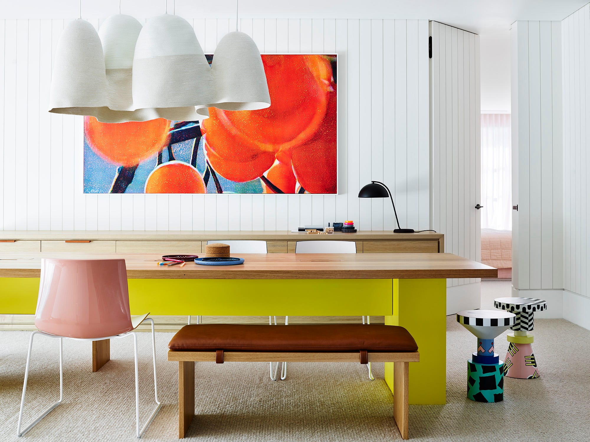
For years, contemporary interiors and objects have treated neutrality as sophistication. White walls, beige furniture, grey flooring, stone palettes emptied of emotional risk. Color became associated with excess, childishness, or trendiness, while neutrality became synonymous with taste. But endless neutrality eventually creates emotional fatigue. Spaces begin to feel visually correct yet psychologically distant.
Butter yellow enters differently. It is gentle enough not to threaten people. Soft enough to live with daily. It does not demand attention the way red or cobalt blue might. Instead, it quietly reintroduces emotion into environments that have become overly controlled. Maybe that is why pale yellow appears first. It functions almost like a transition color between neutrality and expression.
Once people begin living with color again, they often realize the fear around color was cultural rather than personal. A butter yellow chair leads to a green wall. A pale yellow locker leads to painted kitchens, colored bathrooms, softer interiors, and stranger combinations. Color becomes less decorative and more autobiographical. It starts reflecting personality rather than trend forecasting.


Perhaps the real question is not whether butter yellow is fashionable. The real question is why people became so uncomfortable surrounding themselves with color in the first place.
Beige was never really the color of today. Beige was the fear of making the wrong choice.